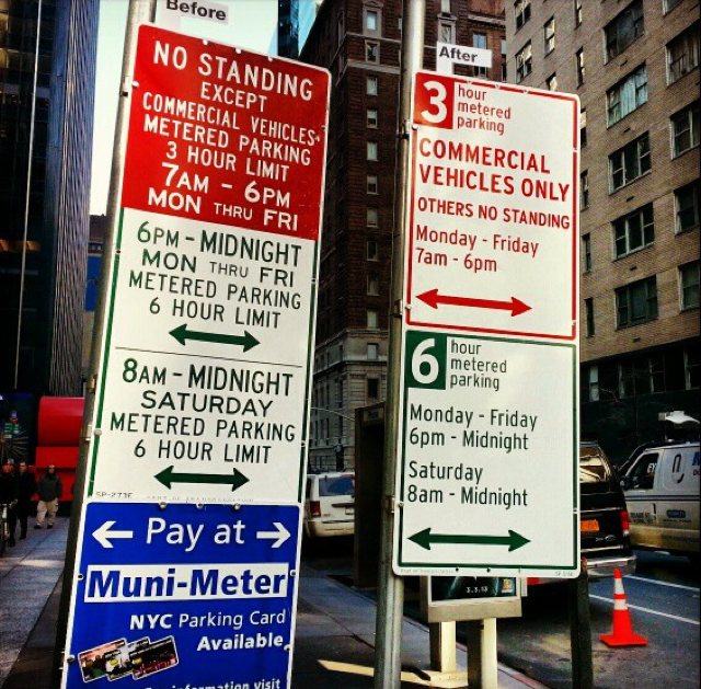
NYC has unveiled new parking signs, which are being heralded as a triumph of information design.
Wow! White space!
The new signs make the days and times smaller, so they’re harder to read at a distance. When you’re driving around looking for parking, you want to be able to read the sign quickly. What leaps out? 3 and 6! Is that helpful?
The new signs still don’t provide the key information that parking is free with no time limit at all times not posted.
And the new signs are organized by restriction, rather than by time. It’s Sunday at 2 pm, and you need to decide whether you’re allowed to park. You have to read everything to decide there are no restrictions.
Why not organize the signs by time, and make the unrestricted times explicit:

And if you really want to save space and continue to keep the free times implicit, you can leave those parts out:

There are a lot of possible improvements here, including making the times larger so they can be read more easily at a distance. There may be other restrictions that make this layout cumbersome. But if you’re rethinking the signs, why not actually rethink the signs?


No comments:
Post a Comment